Statement of intent :
What is the theme and where are you going to show it ?
For this project my theme is "identity"and I am looking at peoples different identities .Examples would be peoples culture,region and what belief is part of their identity.At the end of each gallery I will choose my best and worst images and explain why I think they are my best and worst. I will do this so I know where I went wrong and what the best technique is to use and so that I do not make the same mistakes again afterwards .I was intrigued by the amount of images I could get out of choosing identity as there are many different areas of someone's identity. I am going to make a large portfolio to show my work which will consist of my images,Photoshop,and my finial gallery.I will have my portfolio on my weekly website and I am going to try to make my website look as professional as it can be .However I also may print some of my images out and mix Match some images and see the outcome of it.I am also thinking of creating a hand made book to expand my final outcomes and ideas.
Which artist/photographer will you use?
For my initial research I will start by looking into photographers who do 'identity'. At the moment I am looking at 3 different photographers and these are "Lorna Simpson "."Bobby Neel " and "Ejatu Shaw''. I chose Lorna Simson as she focuses on another identity which is something that photographers do not look at which is the identity of people meaning their hair type or their culture. which is something I am interested in.I like the way she lays out her props before taking the photograph .The reason I chose to research Bobby Neal was because I was interested in the way he combines 2 different peoples faces .And the reason I want to look at Ejatu Shaw is because the pictures she takes are ones that I am interested in and it can inspire me in my photography .I am interested in portraying the culture and religion of others but also the identity that society portray onto women today.
What will you do for the initial research ?
When I chose this project I thought it would consist of peoples religious/cultural cloths but as I explore deeper into it I have realised there are many different aspects to it. There can be peoples gender, sexuality, what they think of themselves or what society expects from a person. I have also been thinking that I could combine the different things about identity. An example would be someone's sexuality and their culture. I could also do some outdoor shots as well as doing studio shots and the range of identity gives me more opportunity to improve my photography and it can improve my Photoshop outcomes.
What photoshoots do you intend to complete ?
To show my progress throughout my work I am going to start with writing on people's faces about what they think about what society expects from them, an example would be that people think that your culture makes you good at one thing and bad at others whereas you can be good at multiple things it does not matter where you are from.. I will then develop them by doing Photoshop to improve them. I will be using the black and white filter on some images, I will be adding text to my images and with some I am not sure I will experiment as I go on .I am hoping to go out and find people that are in outfits that fit their identity and if they let me photograph them and upload them to my website. From research I have many ideas that I can implement into my photography. I will also try to get some photos' at home as I have a park near my house. I will be asking my friend to wear some of her cultural clothes because to her it is something that expresses her identity and something she would not want to give up on. and I could get more pictures and they can be of a better quality. I can also use the filters that I have on my phone.
How are you going to experiment/what equipment?
I will be using a canon DSLR camera as well as a background and some different lights. Sometimes I may use a tripod to hold my camera so I can get better shots . This is my second project so through this I hope I will learn how to use more equipment but also how to get better images . I will also take some images on my phone with a filter so I can compare them to the ones I have on my camera.Through this project I will also try to push myself to think of things that could turn out in good images and get me a better grade. For this project I am planning on working with a professional photographer and for this we are going to have a plain back background and we will be using a camera that is set up to a computer so we can get the images the way we want and how we want it to look.For this we put the camera on a tripod and we had different colours on top of the light and we changed the colours every so often to get new images that we think will look good.
How will I show my progress?
I will show my progress by uploading all of my work onto my website and for my final project I am planning to print out my final images and make it into a book and I will include pictures from all of the photography sections I have done. Throughout the year I will come back to certain areas and improve them if they need to be improved but I will also add to areas in my work as I go on. I am going to try to complete my project by December 16th 2022. Though this time I will also try to do work at home so I have more time to take pictures in school and improve my portfolio.I will be creating a final gallery to show my ideas that have inspired me through the research I have done.
What do you want to learn ?
Whilst doing this project I want to learn more about other people's identity and how it impacts them. This will be shown through the different pictures in my work. I also want to learn how to represent it through my photography. Throughout this I will learn different ways to express identity and to do this I am thinking about not just doing online pictures but also printing out some of my pictures and drawing on top of them.
Lorna Simpson research

Composition
Lorna does studio shots when photographing and she does it at eye level .The way she compositions it makes your eyes focus on the middle of the image .She uses the rule of thirds when she has the top in one line then some gaps between the others and some are longer then the other .When she did the photograph the hair was all one colour except one which is blond which draws your eyes in as it is different to the others. Her images are taken at a foreground. From looking at this image I think that her ISO/WB might have been on auto as it was a studio shot and you can see it has bright lighting to take the image. When looking at this image we do not know what time of day the image was taken but I think that it may have been taken at night or late afternoon as they used artificial light as there might not have been any florescent light in the room .From looking at the image I can see that there is no vanishing points but here are a bit of leading lines as it shows the shape of the image that Lorna was trying to achieve .From this image I think that Lorna may not have used Photoshop on this image. And from this image I can see that it has not been cropped meaning it is less squished together but it draws your eyes to the middle of the image. But also from this image the photographer did use shapes and they were rectangles this was to organize the image and I like that because it makes it look neat . In the image we can see that there is one hair that is different from all of the rest which draws the eyes of the person looking at it and it makes us wonder why she put it there specifically. From this picture we can see that it has been taken on a white background which makes the edges look neat and it makes the picture more appeasing to look at. From analyzing this image we can see that it more modern as the colours are illuminated more and it shows off the darkness and thickness of the hair through the image.
Context
Research from : https://www.britannica.com/biography/Lorna-Simpson
and
https://lsimpsonstudio.com/bio
Lorna is a American photographer who explores stereotypes of race and gender. "Simpson attended the High School of Art and Design in New York City. After graduation Simpson traveled to Europe and Africa, where she not only developed her skill at documentary photography,also began to wonder how she could expand beyond the limitations of the genre,While earning an M.F.A. (1985) at the University of California, San Diego,What emerged was what became her signature technique: photo-text, which involved including brief passages of text .. The images themselves were now posed studio shots, characterized by the use of human subjects, Simpson’s photography typically explored the perception of African American women in American culture.You’re Fine, You’re Hired (1988), using Polaroid prints framed in wood,By the late 1980s Simpson’s work was being displayed in solo exhibitions.In 1990 she became the first African American woman to exhibit at the Venice Biennale,"
"Lorna Simpson first became well-known in the mid-1980s for her large- scale photograph-and-text works that confront and challenge narrow, conventional views of gender, identity, culture, history and memory.Her works have been exhibited at and are in the collections of the Museum of Modern Art, New York; the Museum of Contemporary Art, Chicago; the Walker Art Center, Minneapolis; Whitney Museum of American Art, New York; Los Angeles Museum of Contemporary Art, Los Angeles; and Haus der Kunst; Munich amongst others. Important international exhibitions have included the Hugo Boss Prize at the Guggenheim Museum, New York, Documenta XI in Kassel, Germany, and the 56th Venice Biennale, Venice, Italy. She was awarded the J. Paul Getty Medal in 2019. Lorna Simpson is represented by Hauser & Wirth."
Connections
I am going to use my research to give me an idea of how I might set out my work as i may want to set it out in a way where they are the same then there is one different one that stick out from the rest of them.I am going to use her work to develop my understanding of new ways of positioning my models to make my images of a higher standers.
Comment
I like Lorna's work as it is different to other photographers and she does unique photographs that you would not expect. However there are aspects of her work that I would not do for example the way she layers it out I would spread them out a bit and I would see what taking pictures from a worms eye would look like. I wanted my work to show this because I had the idea of having multiple different people from different backgrounds and having them portrayed in one picture.
Bobby Neel Adams

Composition :
This image was taken at eye level and you can mainly focus on the foreground, and from looking at it i can see that there are no leading lines .The photographer did not use the rule of thirds in this picture ,when I look at this image I can not tell what time of day this image was taken but I could estimate it may have been taken in the morning. I can see that this image was taken at eye level and you can mainly focus on the foreground, and from looking at it I can see that there are no leading lines .I can also see that this image was taken inside of a studio and they used lighting ,I think the photographer used Photoshop when he was editing both pictures so one could go on top and he used a triangle shape for the second picture so it would match on top of the first. From looking at the image I think that the photographer may have kept the WB/ISO the same. .I can also see that this image has been cropped this is so you are closer to the image and you can see the detail. From looking at this picture I think that it has been taken in a studio shot and they used a background with an infinity curve. And I also think that the photographer had the camera on a tripod when taking this image ,I also think that the photographer has a fast shutter speed to take this image .We can also see in this image that they have added a border to the image to make it look more neat . And from looking at this image I like the way that when they photoshoped the 2 images they lined up the eyes to make it look more natural and make it look like it was one eye and not 2 which were put together. From looking at this image we can see that it represents 2 sides of things , one is in the olden days and one is more modern we can see this from the cloths they are wearing and the way they are styling for example it is more modern from when this picture was taken from men would put gel there hair back but in the olden days women would have a scarf wrapped around there hair.
Context :
Research from :https://www.bobbyneeladams.com/biography&
http://kosakova.weebly.com/workshops/bobby-neel-adams
"Bobby Neel Adams was born in Black Mountain, he is an American Postwar & Contemporary artist who was born in 1953."
"In the late 1980's he began using a photo montage technique he termed 'photo surgery', in which photographs were altered through manual excision,
Connection
I am going to use my research to help me come up with ideas of how to Photoshop my photographs and how I would set them out ,I am going to use his work to make my wok better and to improve my work from how it is now and how i can link it to my own work when printing out my pictures.
comment
I do not like Bobbies stile that much as I have a different view of how I would picture in.I would not put the pictures in black and white and I would try to match the pictures and see if anyone would notice. I like the aspect where he gets 2 pictures and joins them together so I may print out some of my images and do some like that . This links to my work because I had the idea of putting together 2 pictures ,one of 2 different thinks- a person whos culture is very different from another.
Ejatu Shaw

Composition
This image has been taken in portrait as you can see the background and the person in the image. The image was taken in foreground and there are no leading lines inside of the image. And from looking at this image we can see the lines in the background which leads to the model which draws our eyes to the model. I think the photographer did use the rule of thirds where there are 2/3 of the person and 1/3 of the background. We do not know what time of day this image was taken and I am not sure if the photographer used Photoshop or not however, I think that the photographer did not use phototoshop for this image .The photographer used patterns on he persons cloths and this shows that she chose the model to wear something that they are conferrable with earing . and we can tell that this was a studio shot and that they used artificial lighting and we can see that it is coming from the area where the model is looking and we can see this from the light on her head. I think hat the ISO/WB was on auto and she might have slowed down the stutterer speed to get this image this may have been done so they can get her natural reaction and her natural facial expressions. We can tell that this image was taken at eye level and the picture may have been cropped to make us focus on the person and not the background. And we can see that the model is enjoying themselves from what we see in the image but also since this image has not been cropped it draws our eyes to the background. From looking at this image .From analyzing this image since it was a studio shot we do not know what time of day this image was taken from however it may have been taken at mid day or when it was golden hour when the sun is at the perfect angle to take pictures if they did not use artificial light and they used natural light . From this image we can see that it is more modern because the colours pop out at us more compared to the others and in the background you can see the Ombre of the pink fading into the blue but also the yellow is not as bright and we can see that is is more of a mustard/neutral yellow that is on her dress which was contrasting with the brown on the dress as well.
Context
Research from : "https://www.itsnicethat.com/articles/ejatu-shaw-adobe-creators-campaign-photography-sponsored-content-010222""https://www.dazeddigital.com/art-photography/article/38286/1/beautiful-images-of-what-being-black-british-muslim-means-ejatu-shaw#:~:text=Born%20in%20the%20UK%20to,a%20relatively%20loosely%2Druled%20household."
She is a London based photographer,"has been interested in photography since she was introduced to the medium in the darkroom at her secondary school. ""Working across both analogue and digital photography, Ejatu uses her practice to tell stories of identity and her own lived experiences. ""
Her latest project began when she was asked by Reform The Funk to create a series of portraits that explore what it means to be a Black British, female, Muslim. But it was only while attempting to understand exactly what that label even meant that Shaw became aware of just how disconnected she felt from the term."Despite the relaxed nature of her own family, Shaw’s journey with religion inevitably had its peaks and troughs. In her teenage years, she chose to wear a hijab in a bid to connect more with her spirituality,"While researching the foundations of her born-religion for the project, Shaw found her personal beliefs flying into direct conflict with those of the community around her. "
Connection
This links to my work because I am planing to take photographs of people in there cultural cloths but also of people with religious cloths like Shaw ,This can inspire me in the future for ideas and different cultures to look at.I like her work as it is different from other photographers as she does different cultures and each image has a different meaning to it.
Comment
I like Ejatu Shaw photography as if you compare it to different photographers it stands out to us ,Also She does not focus on one culture she focuses on different ones but it also links to her life and how she grew up. I also like how she would bring in different things for each person and the way she makes them look happy in there own life. It links to my work because I want to show the different ways of peoples identity for example there culture or there religion .
mood board


Mood Board


Mind map
Shoot plan 1 :
For my project I am taking inspiration from Ejatu Shaw who is known for her identity photographs of her culture and religion , this is because her images are different to other photographers .I admire her work because she does images of things people would never think of and it is very unique .I am going to add to her work because I am going to add messages like she does but about things that are happening around the world and not just one topic.I will also follow her style by using dark colours but with a light contrast .
I am going to be using a canon DSLR camera which I will be holding and I will be doing an indoor shot and I will use my background to create an infinity curve so it will be easier to take photograph and Photoshop ,I will need a light that I can move around to create different shadows ,I may also put different colors on top of the light to see how it would look.I am going to place the camera so that there faces are in the shot .I will keep my ISO and WB on auto but I may occasionally change it to have a different image and see if it would turn out better then the rest. And after I have finished my Photoshop I will uplode my images to my computer so I don't loose any and so I am ready to start editing them.
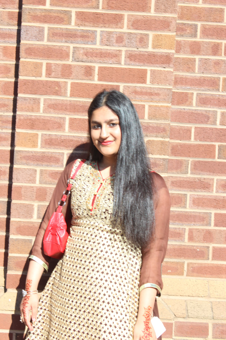
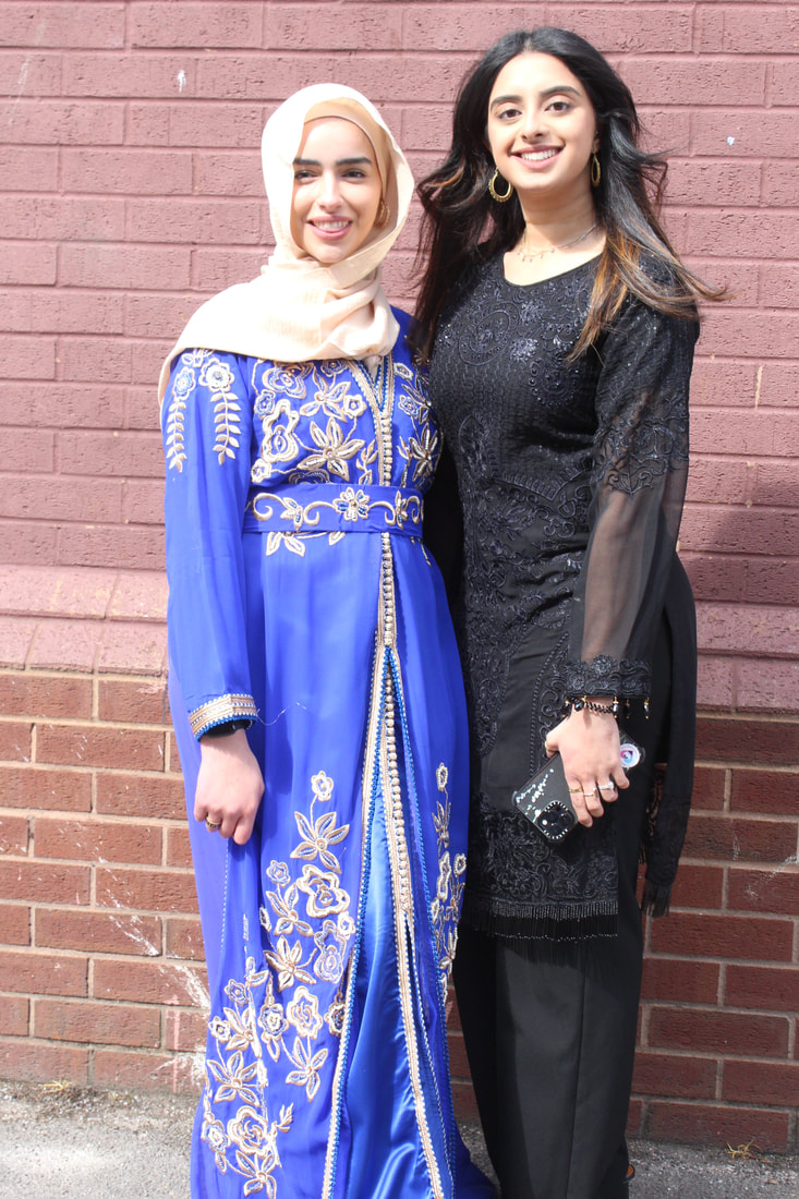
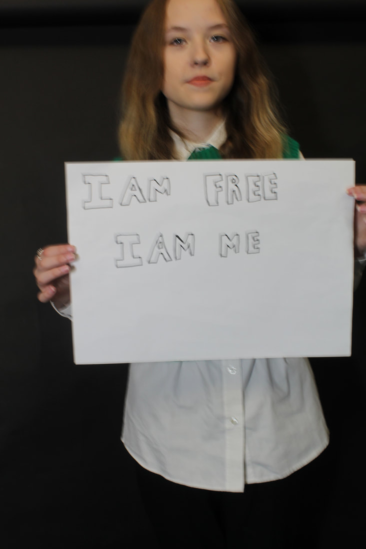
For my photo shoot I am going to ask my friend (Angelica Wood-berry) to wear a black or white top I would like them to have there hair tired up .I will tell them to ware no make up except from the messages I am going to write to express . and have no accessories..I am going to print out messages and cut them out.They are going to be laying down on the floor and have the messages on there cheek/faces,.I will organise the shoot for a time inside school and I will have a white background for the theme I am going for .I am aiming to get approximately 10-15 pictures per model and I would like to see what an image would look like if I used 2 models ,I will also change where the lighting is throughout to get different shadows on there faces.I am taking these photos as many women are stereotyped and I want to make women think they can do what they want with there looks/identity.
I am going to be using a canon DSLR camera which I will be holding and I will be doing an indoor shot and I will use my background to create an infinity curve so it will be easier to take photograph and Photoshop ,I will need a light that I can move around to create different shadows ,I may also put different colors on top of the light to see how it would look.I am going to place the camera so that there faces are in the shot .I will keep my ISO and WB on auto but I may occasionally change it to have a different image and see if it would turn out better then the rest. And after I have finished my Photoshop I will uplode my images to my computer so I don't loose any and so I am ready to start editing them.
For my photo shoot I am going to ask my friend (Angelica Wood-berry) to wear a black or white top I would like them to have there hair tired up .I will tell them to ware no make up except from the messages I am going to write to express . and have no accessories..I am going to print out messages and cut them out.They are going to be laying down on the floor and have the messages on there cheek/faces,.I will organise the shoot for a time inside school and I will have a white background for the theme I am going for .I am aiming to get approximately 10-15 pictures per model and I would like to see what an image would look like if I used 2 models ,I will also change where the lighting is throughout to get different shadows on there faces.I am taking these photos as many women are stereotyped and I want to make women think they can do what they want with there looks/identity.


|

|

|
Best and worst :
This is my best image because you can see the writing on the models face clearly and the way she has her hands it looks like she is thinking about her identity and who she is. Also the shadow behind her makes the image look better and it could represent the 2 sides of who she thinks she is .
|

In my opinion I think this is one of my worst images as the writing on her face came out blury but also I was hoping it would some out centers but it did not.As well as , as I was taking the picture she moved so it does not look as professional as some of my other pictures from this gallery.
|
Photoshop :
Before image :
Steps :
Final image :
The video I used :https://www.youtube.com/watch?v=3asqlda1fqg
|
Firstly, I copped the picture and used the healing spot tool on some areas of her face.Then I changed it to black and white and changed how dark/ light I wanted the colours ,after that I added a gradient map i stopped the colour at a dark grey .Then I put overlay after that .Then I got a paint brush tool and put the opacity on 100 and made the brush big and had a white colour and painted on her face to make it brighter.Then I brought the opacity down and changed the colour to black and darken around her head.After I added a solid colour on top and changed the settings to lighten ,after I added another layer on top and clicked control+shift+alt+e so it would add the image into the layer then I changed tit to unsharpen I placed it on her eye .After that I unlocked the first layer and brought it on top of everything. Finally, I hid the light layer so it was not viable .
My opinion :From doing this Photoshop I think that it would not be the best Photoshop tutorial to use as there are better ones to use this is because in some parts you had to replay it multiple times to know how to do it and some steps they did were not needed so next time i am going to use a different video to follow. I also do not like that way that the image turned out from using this tutorial .
|


Photoshop:

|
The steps I did:First I used the spot healing tool and edited some areas on the face,next I changed it to clack and white and adjusted the colours to make it darker/lighter.Lastly I changed the curve to get the final image .
The tutorial I used :For this Photoshop did not use a tutorial I was experimenting on Photoshop.
|


Final image :

Power of you day:


|
|
|
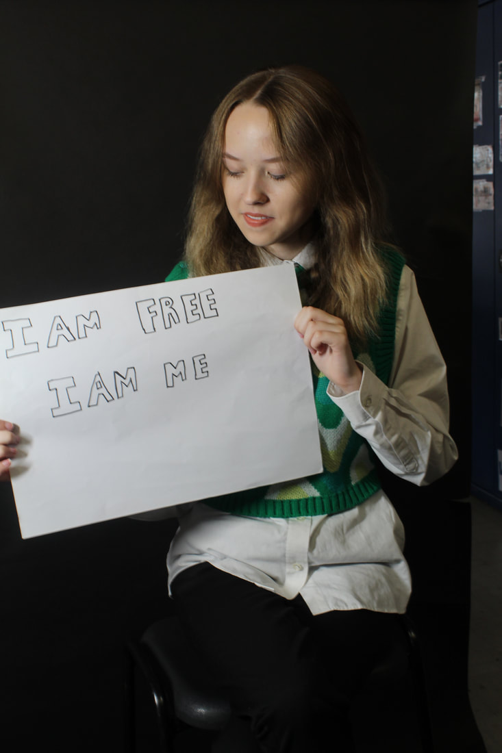
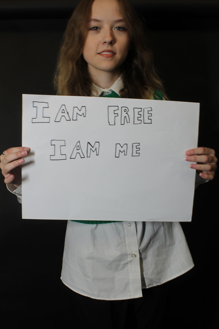
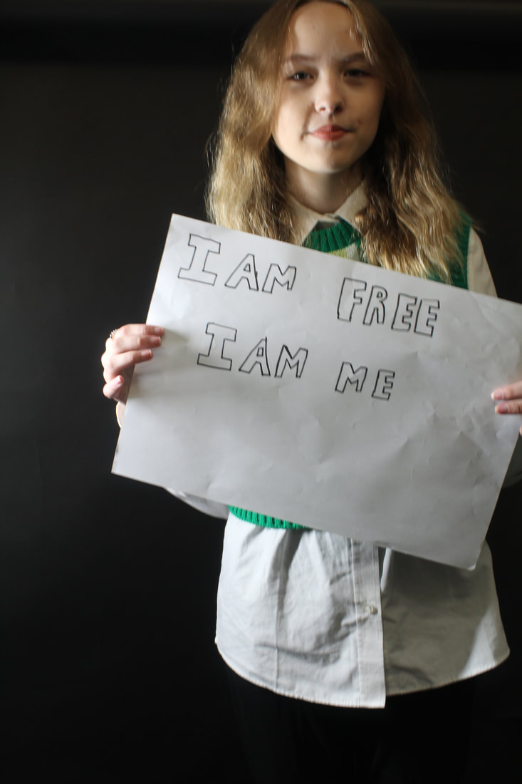
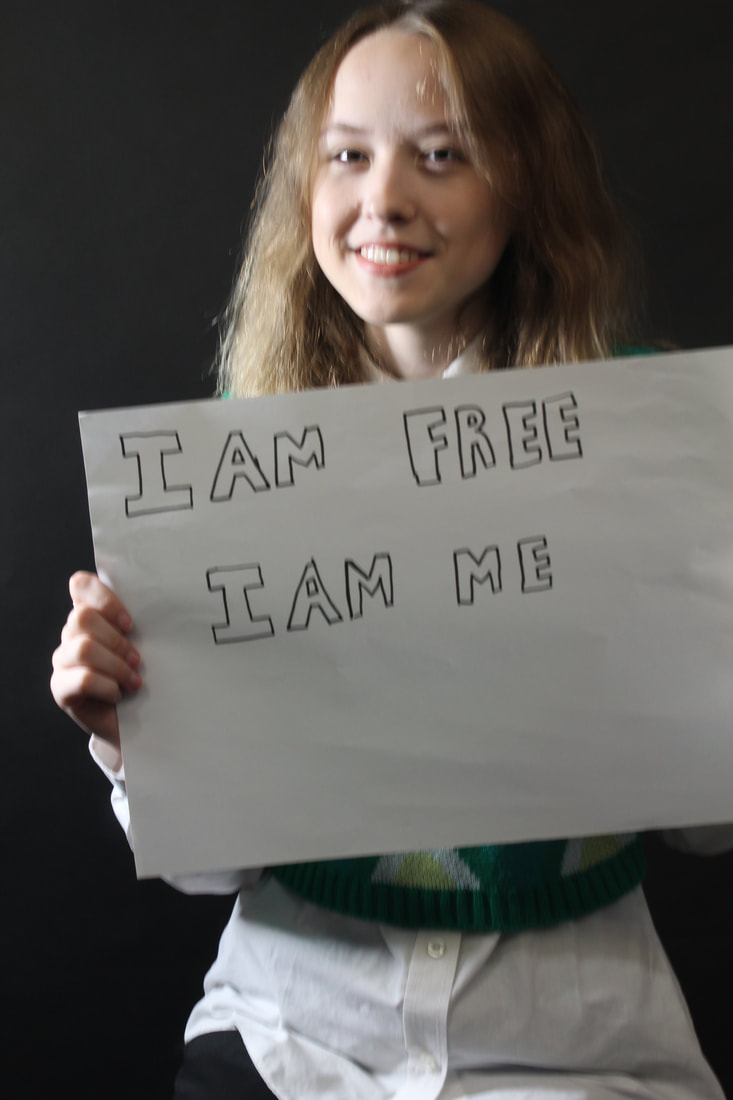
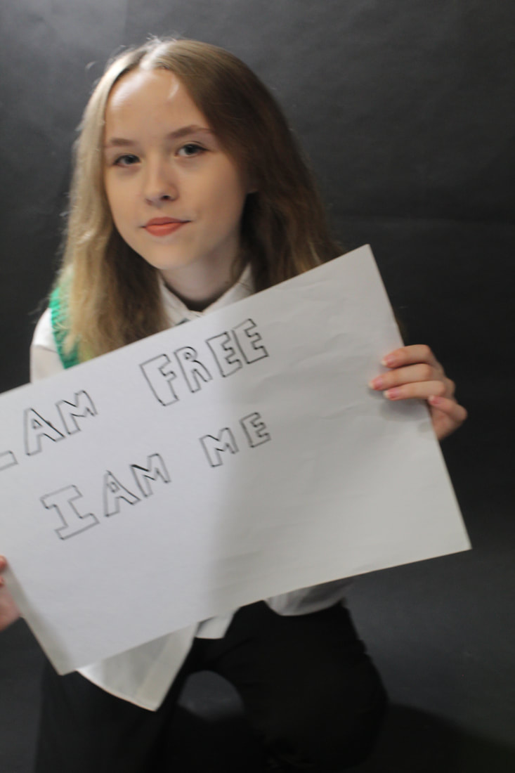
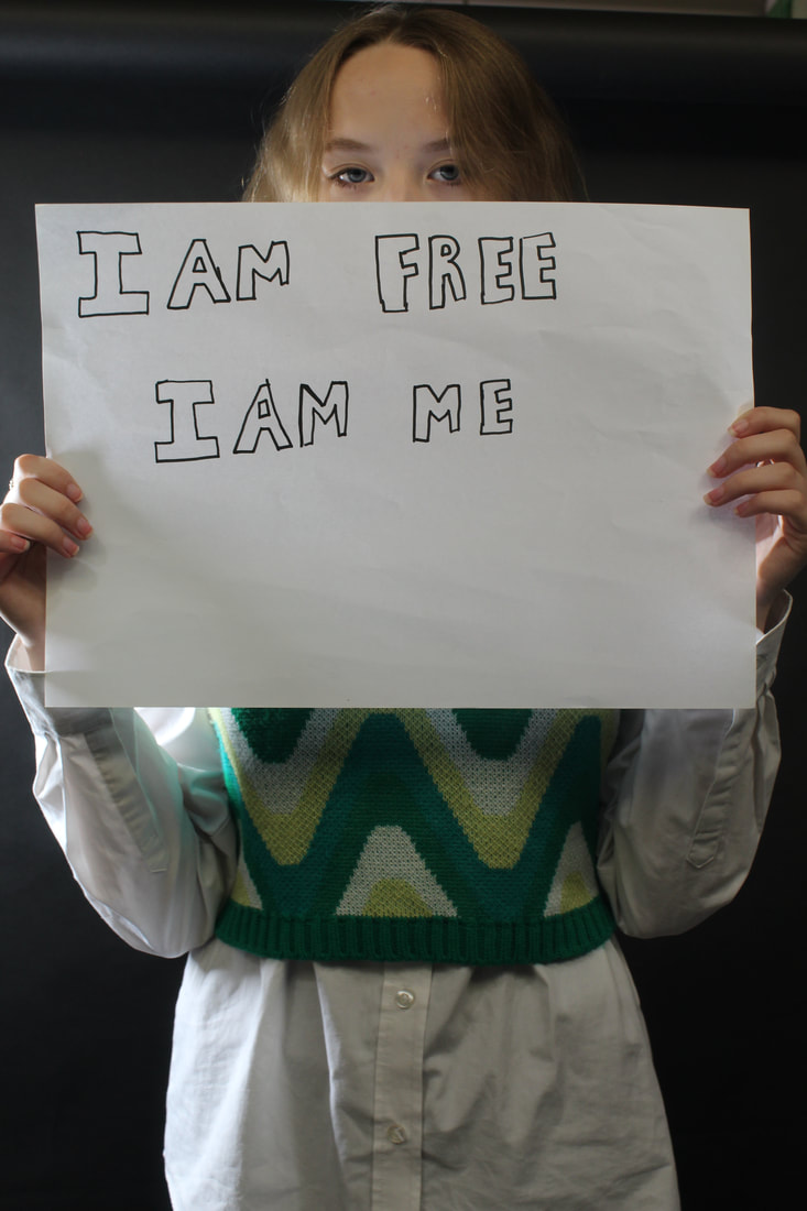
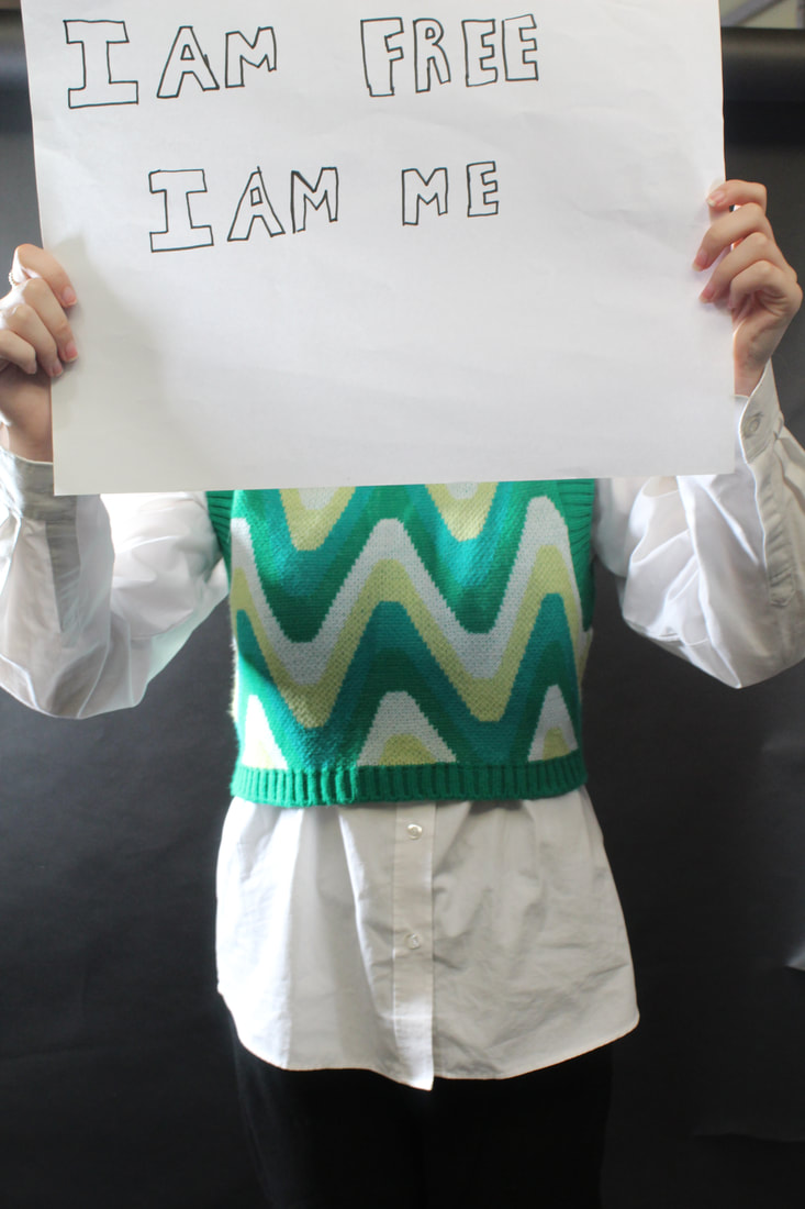
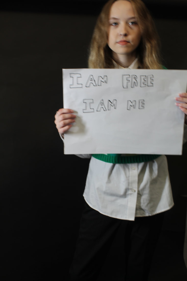
Shoot plan 2:

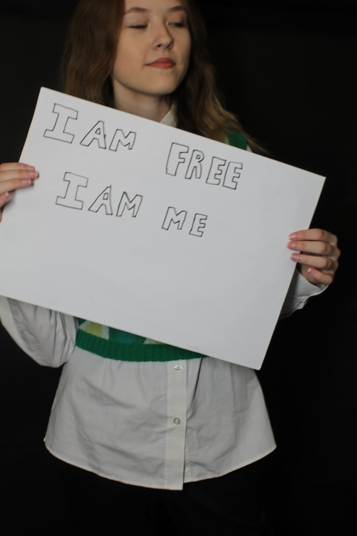
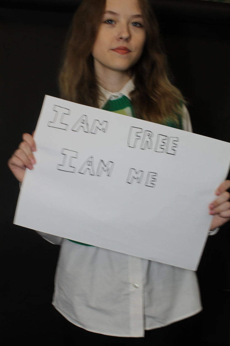
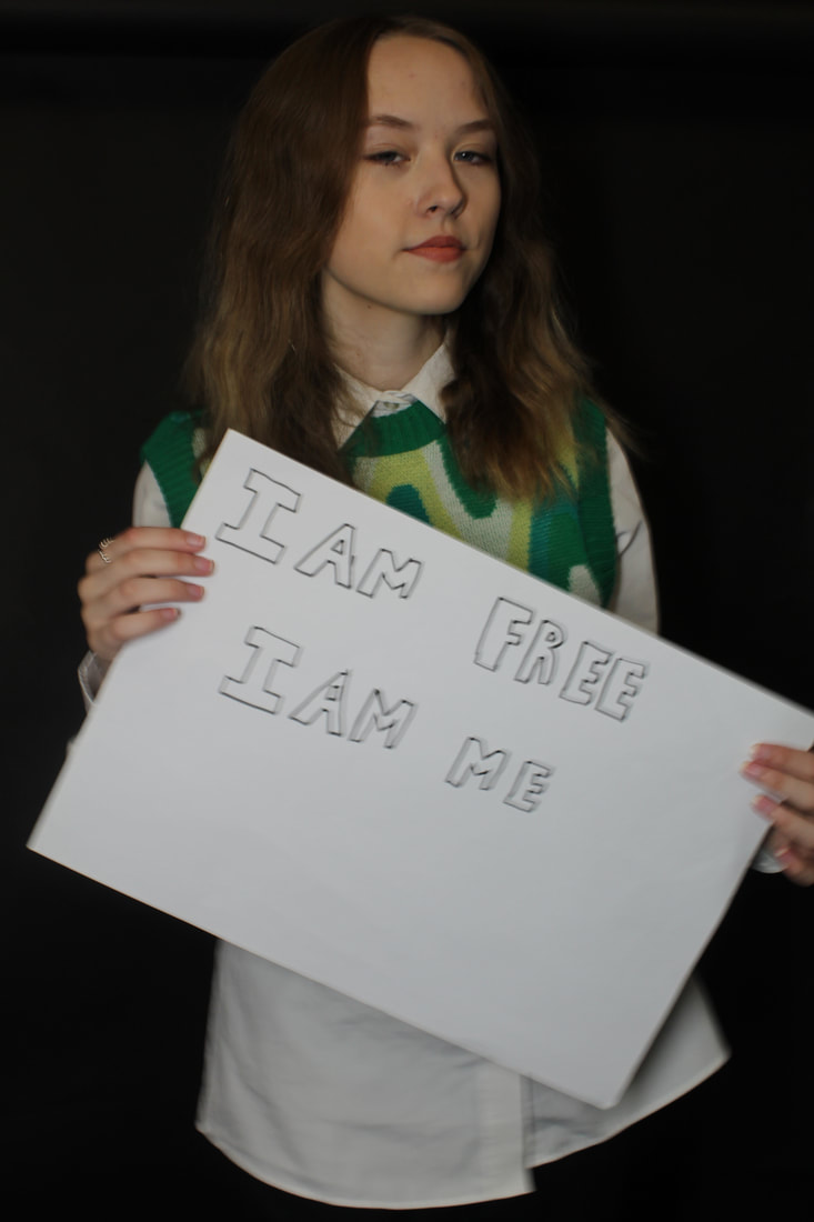
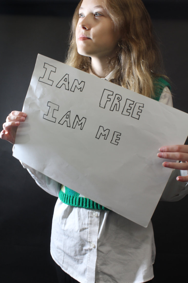
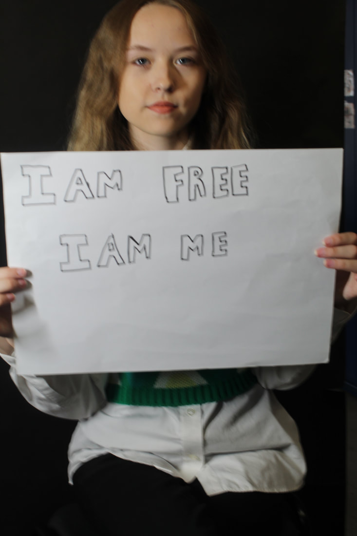
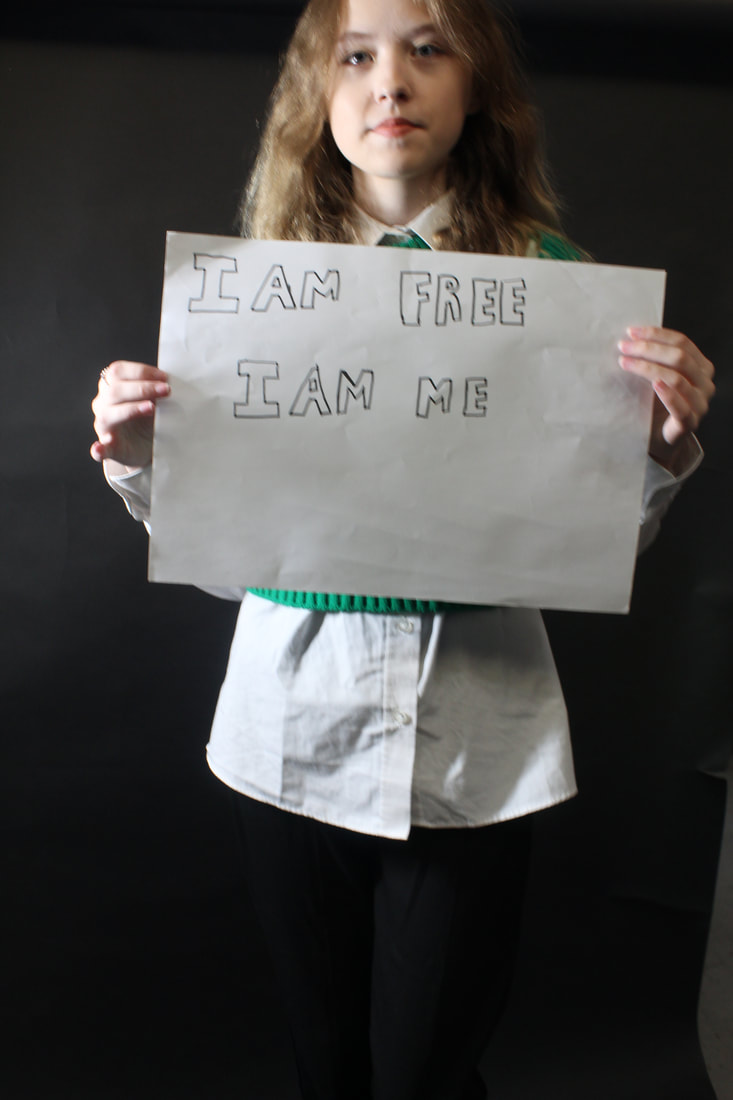
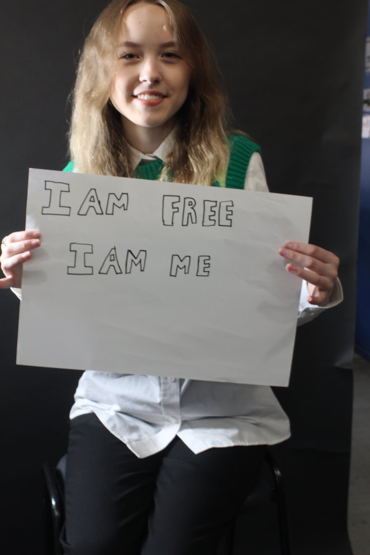
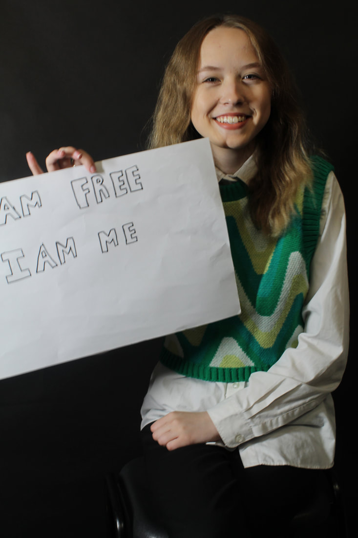
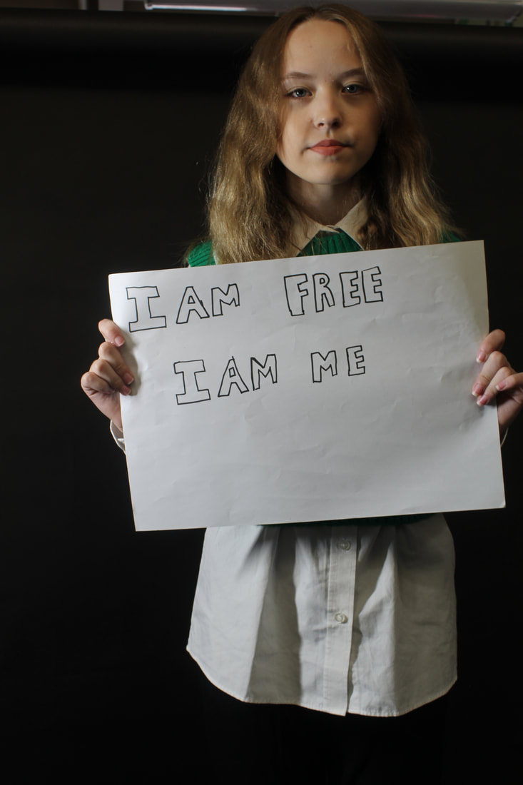
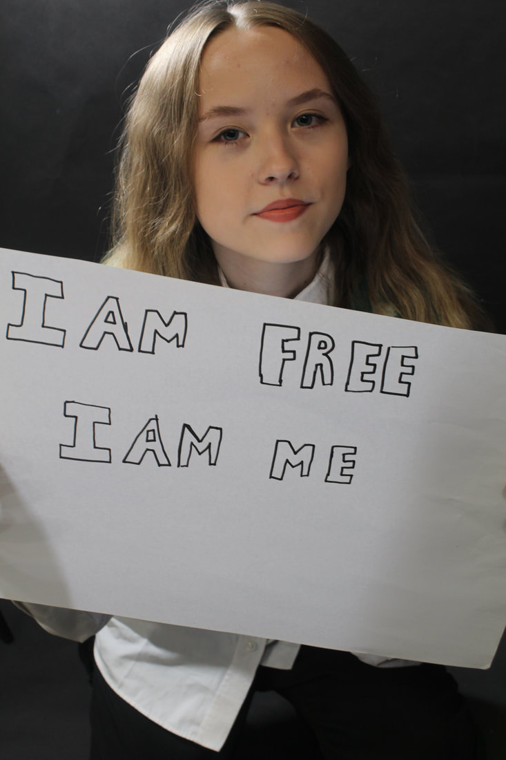
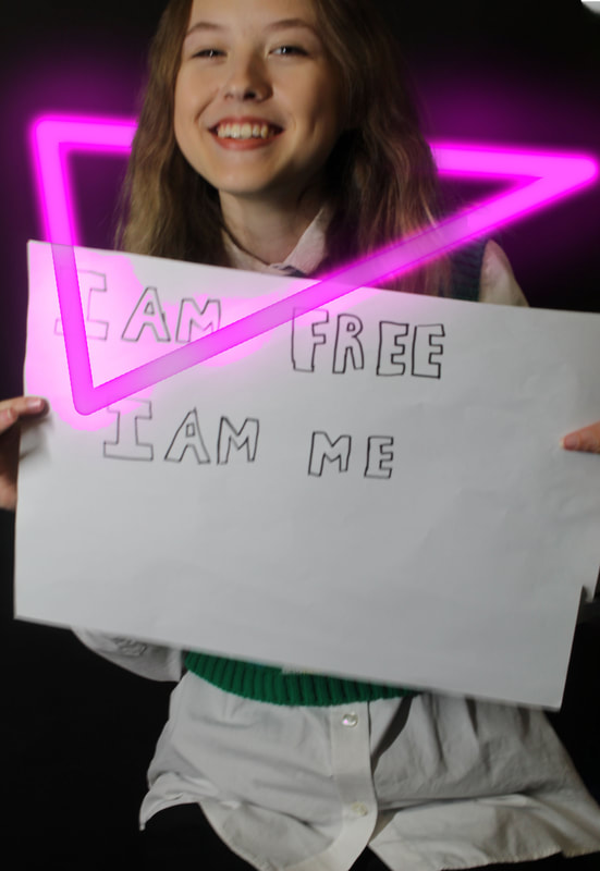
For my next shoot I want to have my model holding up a sighs that says "I am me and I am free".I will do some images inside with a background but I will also go outside and take pictures. I will ask my friend to war an outfit that represents them and I will ask them to wear no make up, I will ask her to wear a neckless if they have one and some other accessories. I will be doing the shoot during out photography lesson ,I will have a black background to go against the sign with I will have on white paper. I will take around 10-15 pictures when we are inside but also when we are outside. .To experiment I will have lights where you can add different clolours to them and I will see which type will fir the photography theme I want to do .
I am going to be using a canon DSLR camera which I will be holding and I will be doing an indoor shoot and I will use my background to create an infinity curve so it will be easier to take photograph and Photoshop ,I will need a light that I can move around to create different shadows ,I may also put different colors on top of the light to see how it would look.I am going to place the camera so that there faces are in the shot but I will also take pictures from far away so i can get there outfit in it .I will keep my ISO and WB on auto but I may occasionally change it to have a different image and see if it would turn out better then the rest. And after I have finished my Photoshop I will upload my images to my computer so I don't loose any and so I am ready to start editing them.
I am going to be using a canon DSLR camera which I will be holding and I will be doing an indoor shoot and I will use my background to create an infinity curve so it will be easier to take photograph and Photoshop ,I will need a light that I can move around to create different shadows ,I may also put different colors on top of the light to see how it would look.I am going to place the camera so that there faces are in the shot but I will also take pictures from far away so i can get there outfit in it .I will keep my ISO and WB on auto but I may occasionally change it to have a different image and see if it would turn out better then the rest. And after I have finished my Photoshop I will upload my images to my computer so I don't loose any and so I am ready to start editing them.


|
|
|
|
|
|
|
|
|
|
|
|
Best and worst :

I think this is my best image because the smile looks natural but also it looks like she enjoys what she is doing but also you an see the sign clearly and you can see what it says.
|

think this is my worst one because she had her eyes closed but also the picture turned out very blurry and you can not read the sign clearly
|
Editing in photoshop
Before image
|
Steps I did |


Final image |
the video I used |
|
https://www.youtube.com/watch?v=3JxCbwn-6bQ
My opinionFrom using this tutorial I like it and I would use it again however in some steps they did not explain it fully so I had to watch that park multiple times. however next time i will use a better image as the top of her head is cut off in this picture.
|
Photoshop :
Before image :

|

|
The steps I did :
|
|
Firstly I cropped the picture then used the Markey tool to fill the rest of it to black then I brought in my second picture and fitted it in.After I added a layer mask go a paint brush on the soft and went over the line that separates the picture to make it look like one.
The video I used :For this I used a bit of a video but for most of the video I used it for a bit then started experimenting as it was not turning out write.
https://www.youtube.com/watch?v=bZWWtEqEOCw&t=49s |


Final image :

Homework :
|
|
|
|
These images are not one of my best images as you can see that the carpet if folded but also you can see things that do not make the pictures look at a high standard in the background.
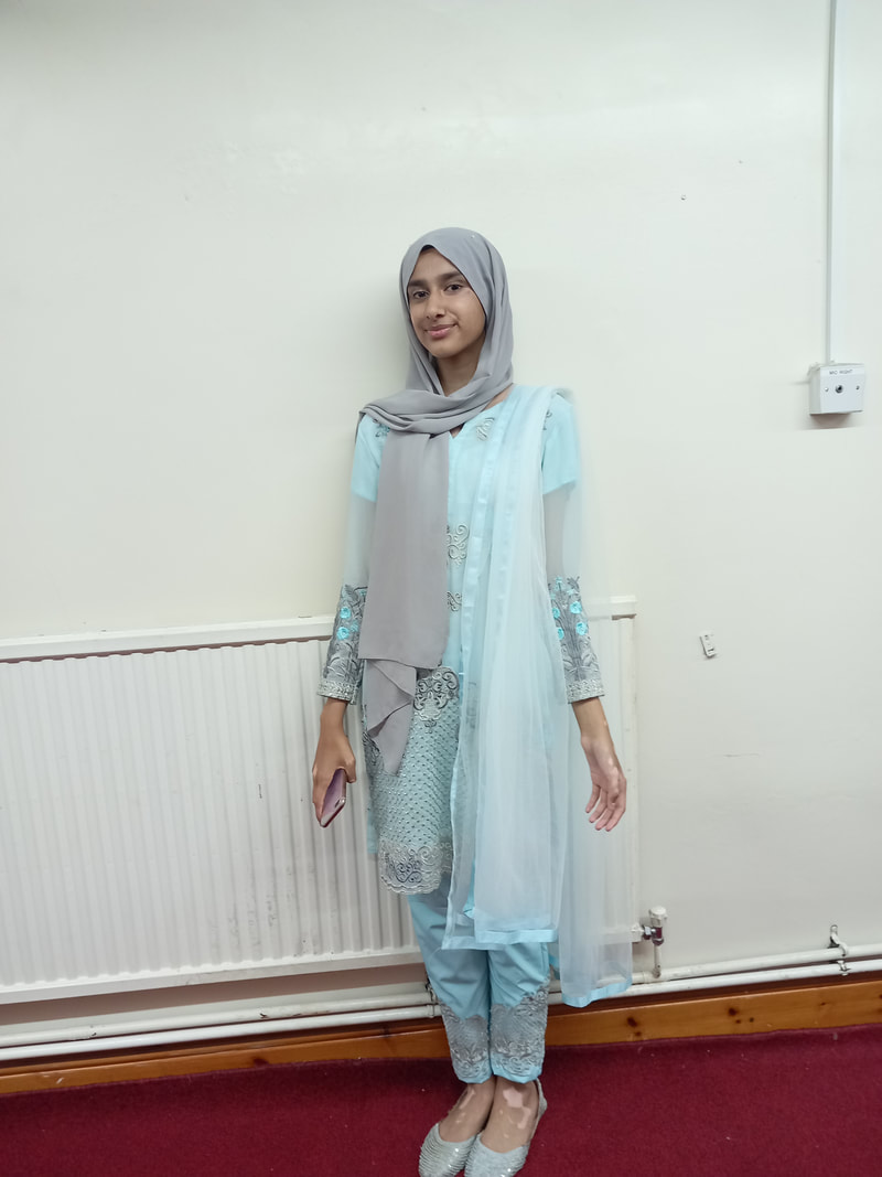
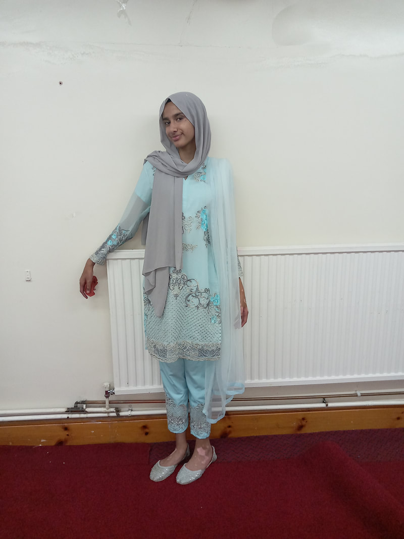
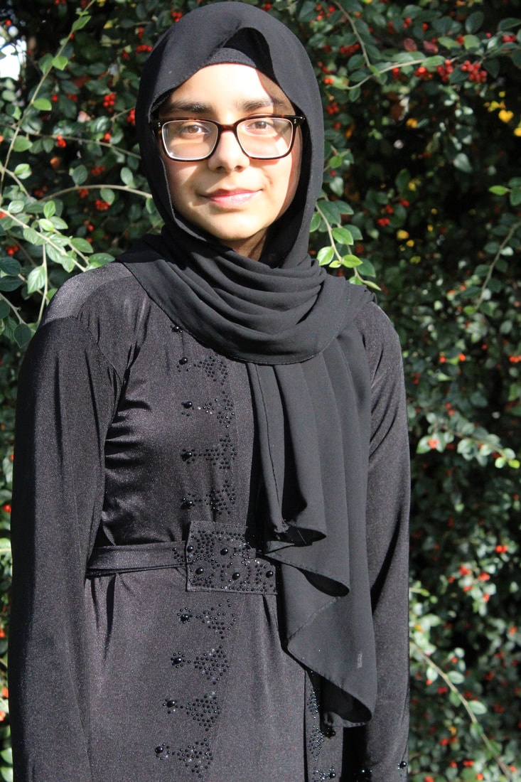
Shoot plan 3:

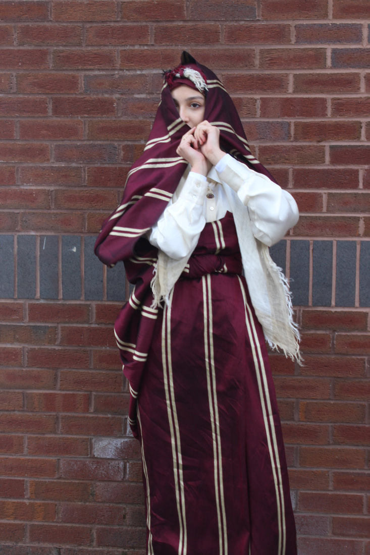
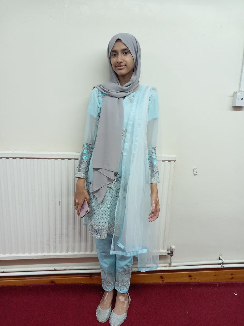
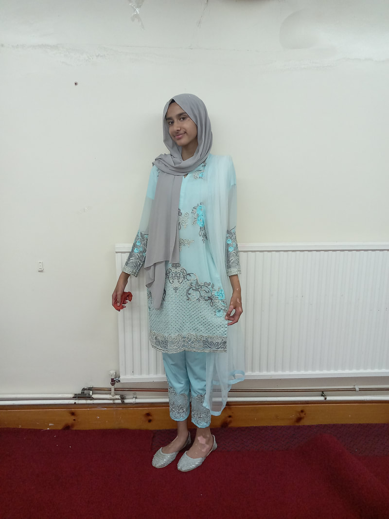
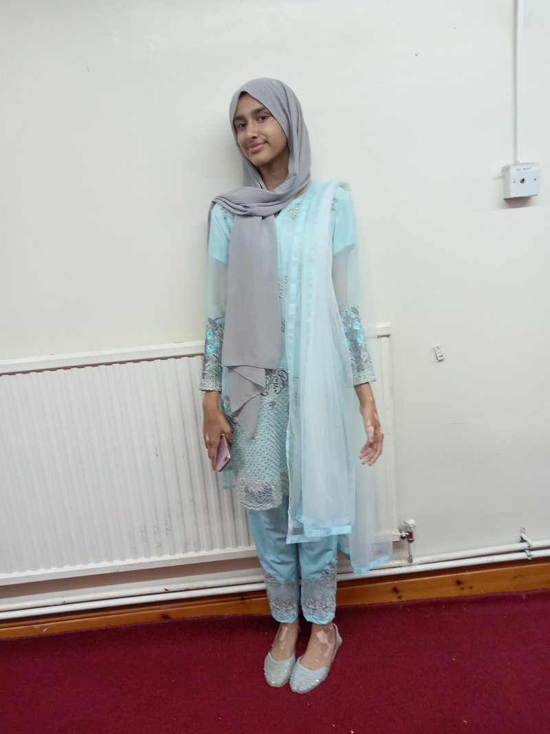
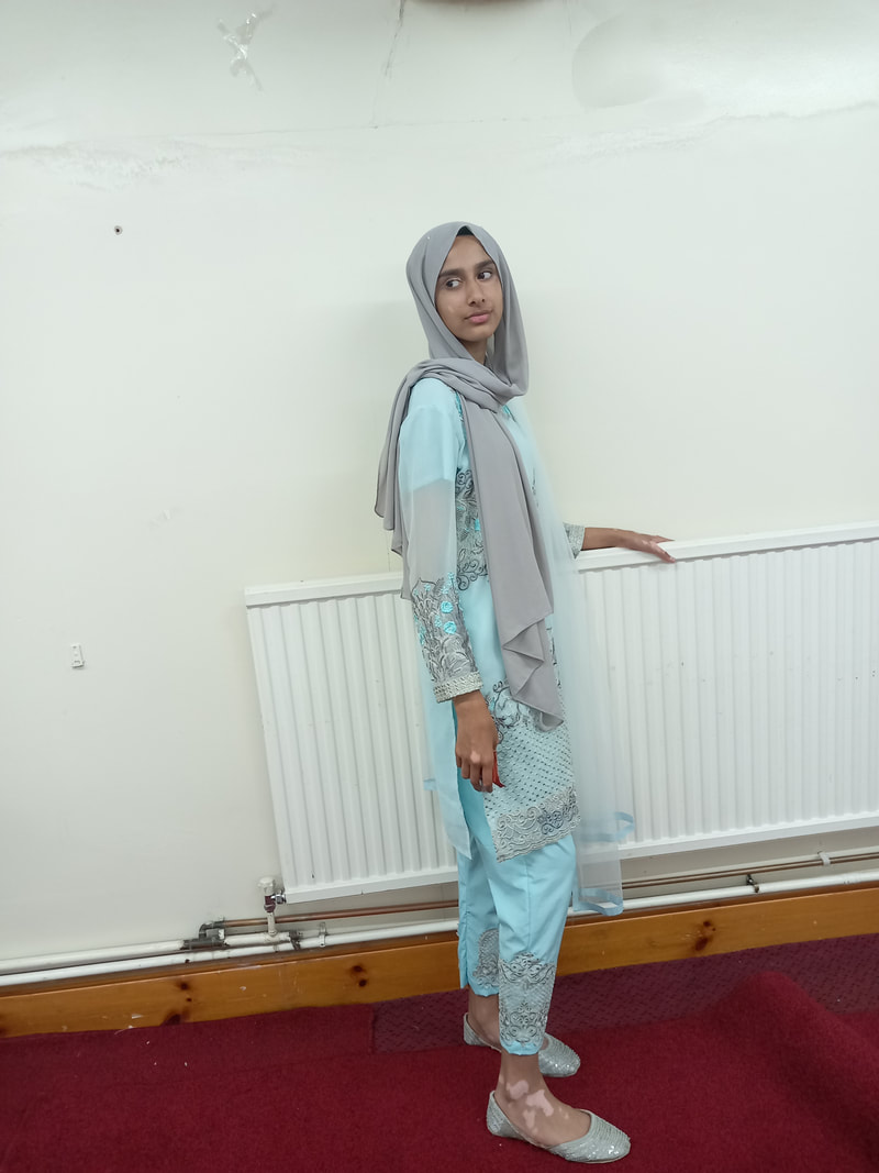
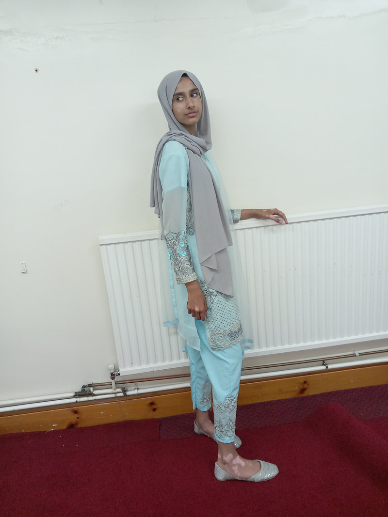
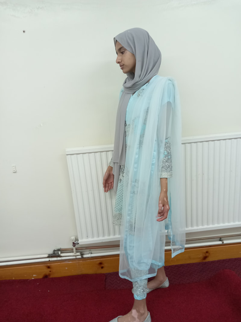
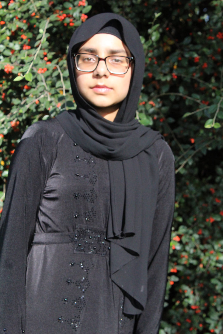
For this shoot, I will be using a Canon DSLR camera and I will have ISO and WB on auto however I may experiment and use different ones. I will also be taking some pictures outside on the field near the trees to get a different and to light it I will be using the sun as it can give her a nice glow.
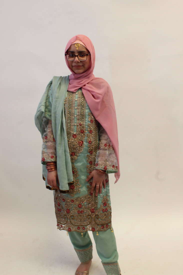
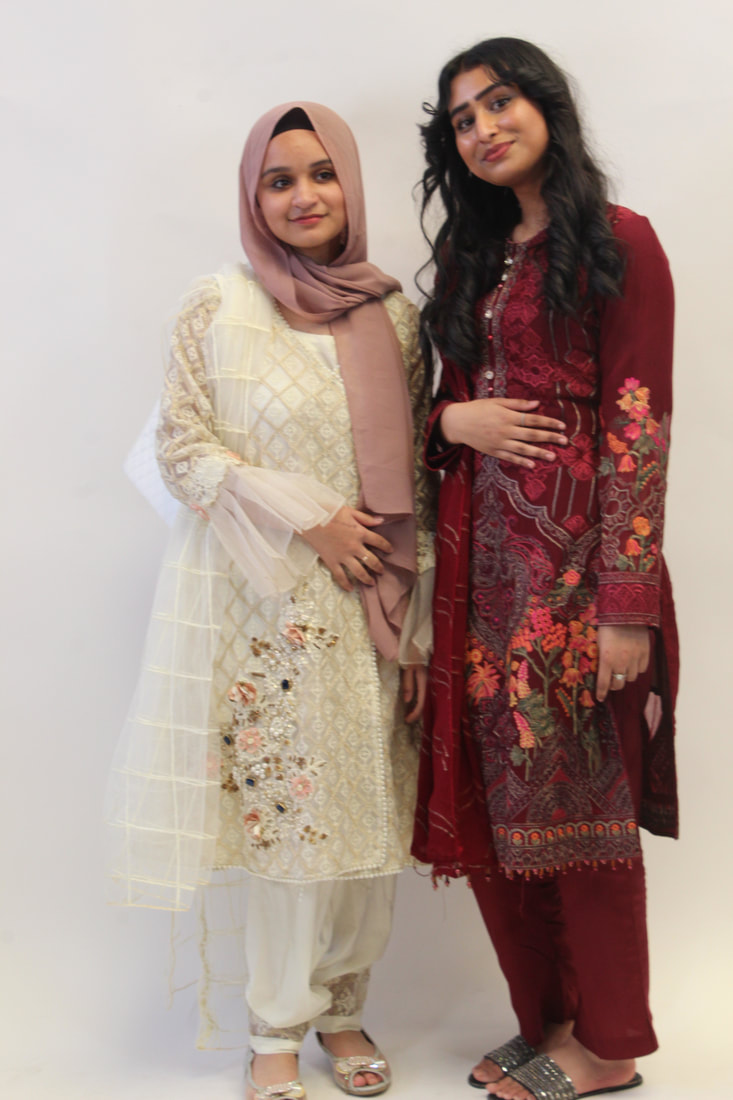
For this shoot I want my model to be wearing religious/modest clothing and a black headscarf, she will be wearing a bit of makeup but not a lot that is very noticeable. I am planning to take a minimum of 30 photos. To experiment I will want her to stand in the middle of the field to see the perspective of getting some of the trees in it but I will also want her to stand near a berry bush but I will also get some picture of her standing against a wall to get a contrast of the 2 things. one natural and one manmade.
For this shoot I want my model to be wearing religious/modest clothing and a black headscarf, she will be wearing a bit of makeup but not a lot that is very noticeable. I am planning to take a minimum of 30 photos. To experiment I will want her to stand in the middle of the field to see the perspective of getting some of the trees in it but I will also want her to stand near a berry bush but I will also get some picture of her standing against a wall to get a contrast of the 2 things. one natural and one manmade.


Best : |
Worst : |

This is my best image because I like the way you can see the bush in the background so it adds some colours to the picture and the lighting is good on this picture and she looks like she is enjoying herself.
|

I think this is my worst one because the model if facing away from the camera which I originally wanted but she is also blinking which made the picture look bad .The image is also a bit blurry .
|
Photoshop
Before image : |
Steps I did : |

|
|


Final image : |
My opinion : |

|
I liked this Photoshop but when doing it near the end I did realize that you would not be able to see the text so I moved the writing to the opposite side of her face.
But overall I would do this Photoshop again however I would do it with a model that is looking straight into the camera. The reason I chose to do this was because at our age there are many people who question there identity for example they do not like there culture or they are not comfortable with the race they were born or the religion they have and they want to explore further .
The video I used :https://www.youtube.com/watch?v=fj_iwNgv8aQ&t=188s
|
Photoshop :
Before image : |
The steps I did : |
The video I used :https://www.youtube.com/watch?v=fj_iwNgv8aQ&t=188s
|
My opinion :I like this photoshop idea and I am going to continue using it but I am also going to experiment whilst doing it to get more outcomes.
|


Final image :

|

|
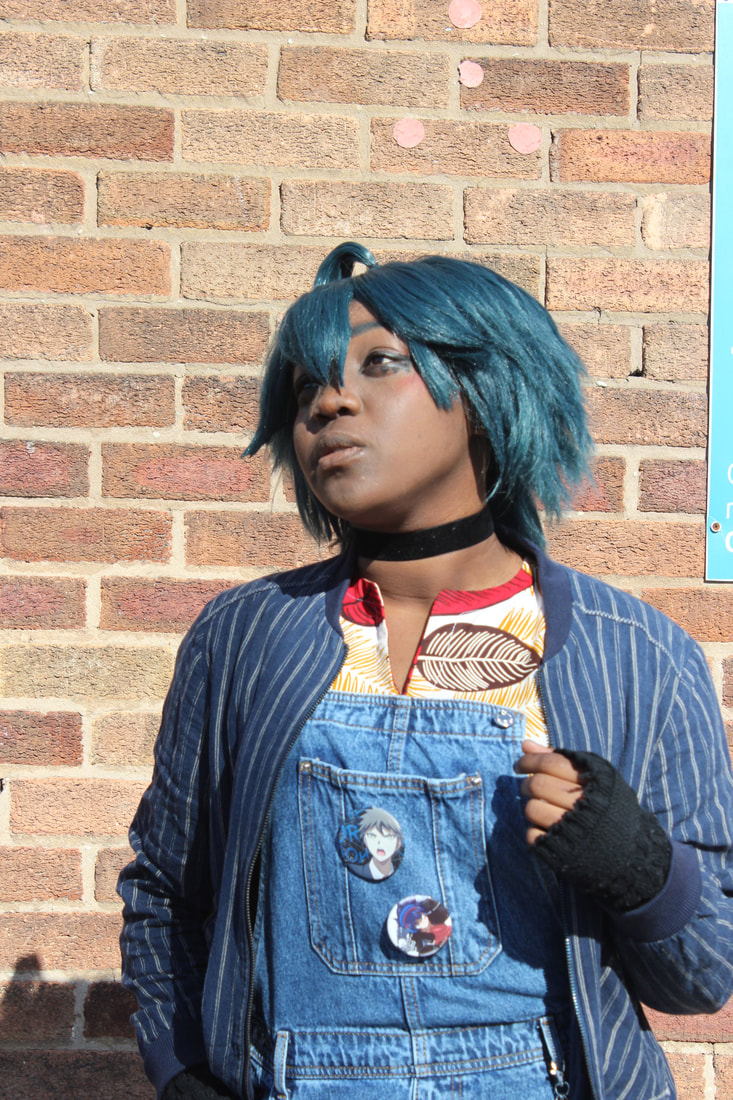
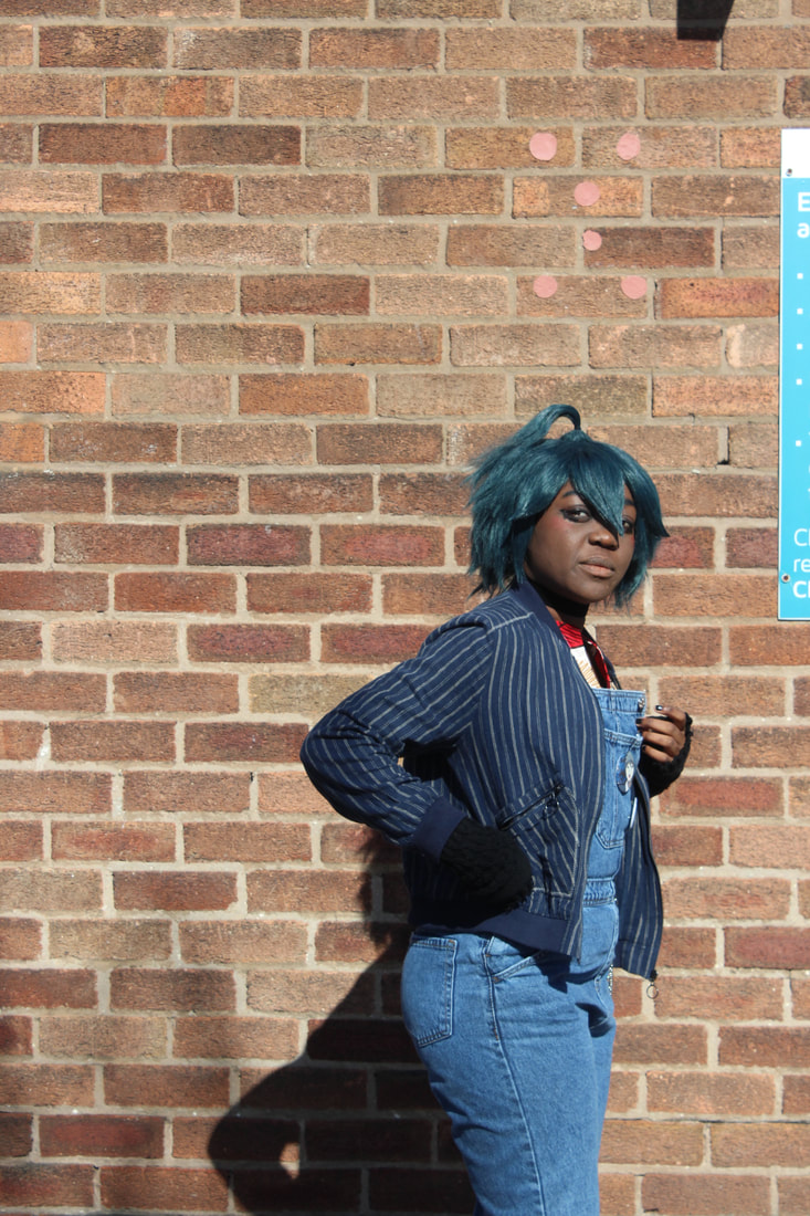
Shoot plan 4:


|
For this soot we used a black and white background to have more of an effect and to get the image close to the one we imagined . We also used different cultured gels inside of the lights ,at first we just used blue but then we changed it to blue and red then we changed it to blue and purple and finally we did purple and orange. For this shoot I used a canon camera which was connected to a laptop so that we could see what was happening through the camera and we could see each image after taking a picture. and for some of these images Justine held a reflector so there was less of a shadow on her face and the light reflected onto her face and hair. For this shoot we worked with a profession photographer named Justine and he helped us improve our images.
For this shoot my model wore a plain black top with camo pants and for this shoot she had her hair out and was wearing make up , for this shoot I had my model stand in multiple postilions and face different directions to experiment how it looked when different coloured lights to see how it looks on her face and hair.. and for this shoot I did not have a minimum amount of pictures I just wanted to get lots of pictures so I could expand my project. |


Best and Worst :
Best : |
Worst : |

|

|
|
I think this is my best picture because the opposite colours (orange and purple ) make this picture stand out as the purple makes the models hair look like she has died it but also the orange on her pants make them look very nice , for this picture we used a reflector so there was no shadow on her face which made her face brighter and have no shadow parts.
|
I think this is my worst image because I do not really like the white background but also the models eyes were closed and the light is not focused on her and you can see the Background more then the actual model ,however compared to the pictures with a back background the white background makes her top look visible .
|
Photoshop :
Before image : |
Steps I did:
|

|
|


Final image : |
Firstly I wrote my text then I adjusted it to a way I think it would look nice then I hide the model text so I could adjust the picture I selected the model then made the text visible again .After that I added a layer mask and unlocked the layer mask form the model and moved it around the picture to find the best place to put it .
My opinion |

|
I like this photoshop I did and I di this. because lots of people in this generation has many questions about there identity and many of them them go though identity crisis but lots of parents disagree with there thinking .
The video I used :https://www.youtube.com/watch?v=uqdmm7AA0uU
|
Before image : |
The steps I did : |

The video I used :https://www.youtube.com/watch?v=fj_iwNgv8aQ&t=188s
|
My opinion:I like this photoshop idea and I am going to continue using it but I am also going to experiment whilst doing it to get more outcomes.
|


Final images :

|

|
Before image: |
Steps: |

|
|


Final images :


|

The video I used:https://www.youtube.com/watch?v=fj_iwNgv8aQ&t=188s
|
Mock exam :
Before image : |
Steps: |

|
|


Final image :


Before image : |

The video I used:https://www.youtube.com/watch?v=fj_iwNgv8aQ&t=139s
|

|
Steps : |


Final image :


|

The video I used:
https://www.youtube.com/watch?v=fj_iwNgv8aQ&t=139s
|
Canva Book


Final gallery :


My comment :
I think that I did well on my Photoshop outcomes because I could get multiple final images from one idea I also liked how I could experiment whilst following a tutorial so it has a bit of your won ideas and not just have the tutorial says. . I think to improve my outcomes I need to use different patterns and not the same ones and maybe add multiple patters ,one for the background and a contrasting one for the writing. Another way in which I think I can improve is by using different writing for each outcome for the one picture so that I have more variety of outcomes and my work can become better.
Evaluation :
What was the project theme and what did you think of it?
For this project my main theme was identity and focusing on the identity of religion culture and expectations of people. I explored this in different ways by asking people to wear outfits that represent them such as cultural cloths or religious cloths however some people did not have cultural or religious cloths they wore cloths that represented them as a person within themselves. I thought this was a good theme because there are lots of ways I could have represented a persons identity and not just one option also I was also to have multiple images with just looking at one theme as one theme has multiple sections , for example the idea of culture there are multiple cultures which is shown thought the people , what they believe and how they dress and much more. From doing this project I have realized that I could be creative as I like and have my own ideas clearly portrayed in my photographs. After finishing this theme I have realized that compared to my other topic that my knowledge and skills in photoshop and taking pictures has improved and I am staring to get more developed and they some look professional .
What part of the project did you enjoy the most/found most interesting (taking photograph? Photoshop? etc.)
In photography I found the use of photoshop most interesting because there are multiple tutorials to help you improve your images and how you could have your own ideas implemented into it and you can be creative with it even if you are following a tutorial because it gives you the chance to add your own things and not to follow the tutorial step by step so it turns out the same . I did like taking pictures however between both of them I would pick Photoshop because it does not take planning and all you need to have is an idea of your final outcome and a tutorial you are going to follow if you are. I liked it when I did the holiday shoot because I got to work with a professional photographer and learn better ways to use a camera and better angles to take the picture and it was a set time to take my pictures where I could go and take the pictures that I can use in my work. From doing my second project I have learnt better ways to take images using a manual camera but also taking some images on my phone and comparing them.
What new techniques have you experienced?
From using a camera more I have learnt new ways to use photoshop for example adding a gradient or pattern to the background instead of it being black or white. To do my final outcomes I used a YouTube video that made your images look like a poster . For this photoshop outcomes I changed some images to black and white then I clicked on the object selection Toole and went around my model , then if there were areas left I went in with the quick selection Toole. After that I created a background sometimes in back sometimes in white after I dragged in my model and placed it where I wanted it, then I used the marquee tool on the side I was going to have the writing then I selected the writing tool nd wrote what I wanted to then I clicked on the t in the layers area and made the wring clear by clicking on the eye next I selected the doge tool to make some areas lighter and if it did not help I selected the brush tool with a low opacity and went over those areas.
What technique would you like to develop further?
In the future I would like to develop my photographing skills so I can get better images and some of my images turn out less blurry and are of a higher quality. For my next project I want to learn how to make my images more of a higher quality and I want to learn how to get some of my images looking like a professional photographers images. The ones I have done with a professional photographer compared to the ones I have done on my own to make them better I need to learn how to get my lighting better and trying to take my images at different angles.
Which photographers did you research through this project?/How have they influenced your photographs?
I researched Lorna Simpson ,Bobby Neal Adam and Ejatu Shaw .Lorna made my work personal because it was exploring the culture and religion of people which not many people show and she explores the culture of people that she can relate to which is what I wanted for this. The reason why I researched Bobby was because I wanted to do photoshop like that however after I tried it I realized I did not like it that much and it would not fit in with the ideas I had in mind . And I researched Ejatu was because she could relate to me growing up in the UK and she wanted to show off other cultures which was something I was interested in doing with this project which is where it has lead me to now and I showed the culture of different people through my work which is how I wanted to link it to her work.
What do you feel is the most successful part of your project and why?
I think the most successful part of this project was the shoot we did with Humera this is because during that time I needed more images to put into Photoshop and that shoot gave me lots more images to work with. But I also think the shoot with Justin was also one of the most successful parts this is because it was the one time we got to work with a professional photographer and he helped us develop our images further to make them look more professional.
Did you encounter any problems in your project?/How did you learn and how did that affect your final images?
During this project one problem I encountered was trying to find time where me and a model are available to take pictures outside of school , another problem was knowing the best time to take the pictures and telling models when to bring in there outfits so we can take the pictures. Another problem at the begging was one of the photoshop ideas I had this was because they went onto a website
What would you do differently given the chance to complete the project again?
If I could do this again I would try to get more images of people outside of school and I would also try to bring some props into school to experiment with them.If I could do it again I would also focus on time management this is because during this topic I did not get much time to take images as it took time to set up the set and have my model changed so next time I would have the set up beforehand and I would try to do more outdoor images as you do not need to set up for them.
